Give us a ring
The simple life is for me out here in Brunswick, Maryland. Give me a shout sometime and let's talk shop.
Reach out
phone:
email:
tomfoolery


-
Client:
Personify is the market-leading Constituent Management & Engagement (CME) platform. They also have a robust events platform, 365 community and a membership management software for emerging nonprofits.
-
User Personas:
Jackie: (62) is an extremly busy show organizer that has been asked to do it all for her event.
Jimbo: (28) is brand new to the events industry and he has been tasked with assisting Jackie at times with tasks such as adjusting the event's floorplan.
-
Tools:
Mac OS X, Sketch, inVision, Zeplin, Visual Studio Code, HTML5, Bootstrap, CSS3
Problem Statement:
New clients that needed to quickly access their floorplan in our global admin system found it challenging to navigate the interface. Having easy access and ability to make extremely time-sensitive changes to the floorplan is extremely important for event professionals and the previous offering was not providing this.
(Classic) Floorplan "Before":
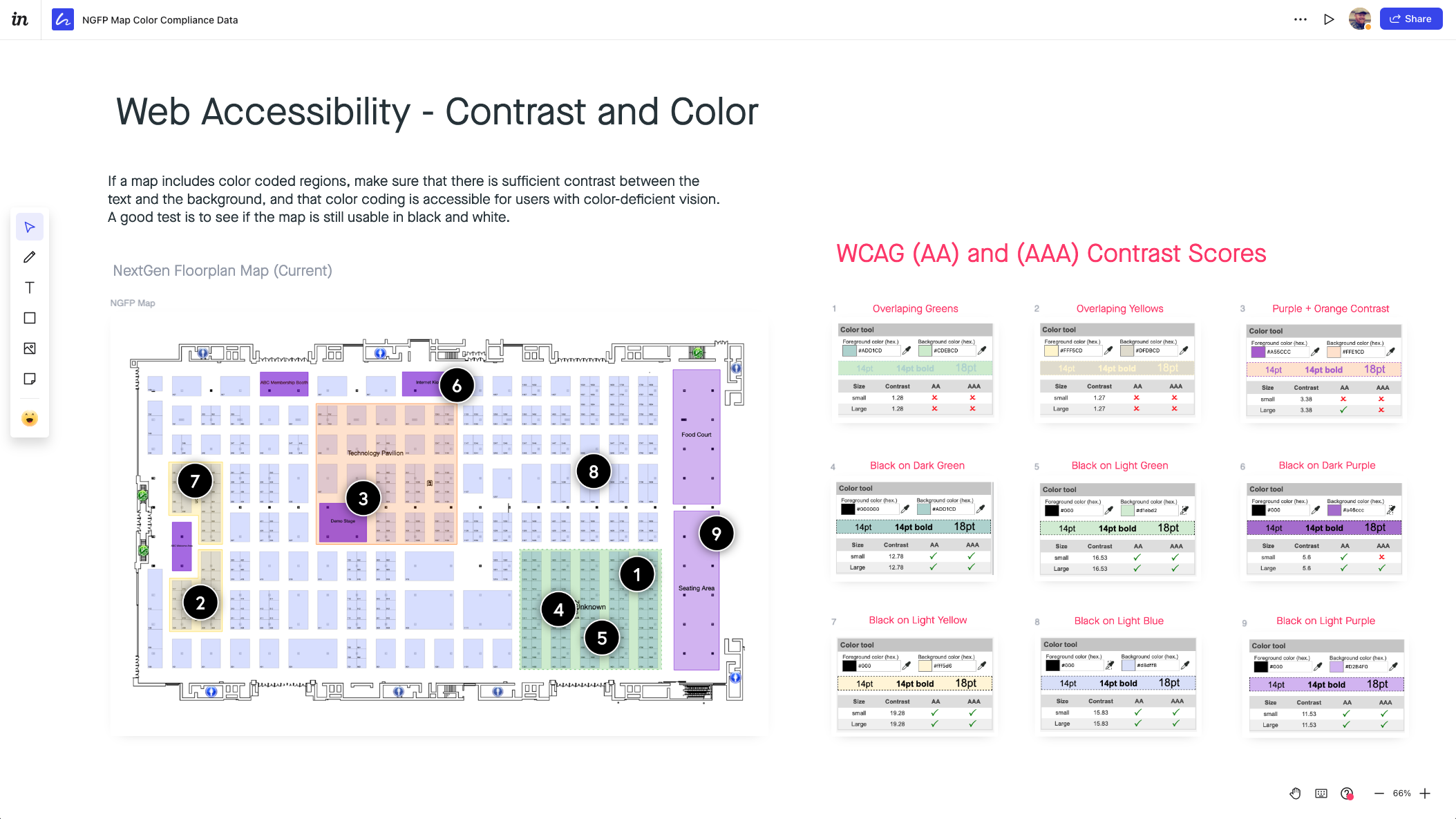
Accessibility Research:
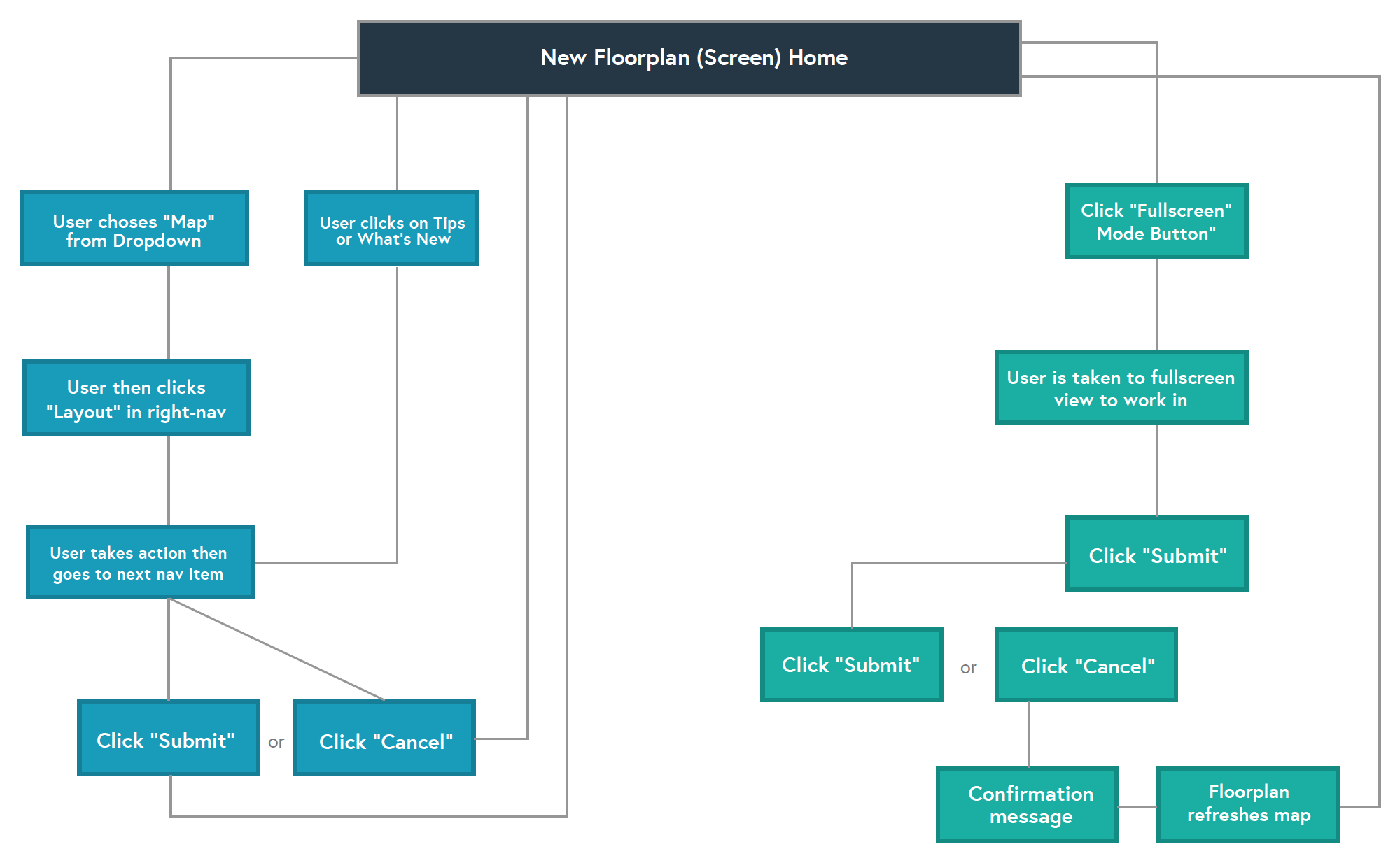
User Flow:
My Responsibilities:
Accessibility + Client Research | Wireframe + Prototype | Frontend Development
With help from our internal project management team, I collected staff and client feedback, developed developed user flows and bundled in some accessibility research to create wireframes, prototypes with another designer for A/B testing. Then we built out the static HTML/CSS for the new UI before it handed off to our developers. Finally, I worked closely with our R&D team of devs to ship a solution that was more accessible, learnable and pleasing to use.
Users and Key Players:
Personify A2Z Events cloud-based software is purchased by a trade show manager. It is then deployed by a TSA (Technical Solution Architect). A dedicated (PM) Project Manager will deliver all Global Admin and public site url's for show managers and teams to login and begin their training in the system. See a few of the other stakeholders involved below:
- Clients - The end users that would build and configure their floorplans.
- Product Management - The team responsible for organizing, managing and deploying the final product.
- Leadership - Our previous CEO was heavily involved with the solution as he was the original architect of the system.
- Design Team - The solution needed to be accessible and customizable for some of our higher-tier client relationships.
- Sales Team - Sales needed to be able to speak on how robust, effective and simple it was to configure in Global Admin.
Research and Inspiration
This one was challenging as we didn't want to mirror or be influenced by any other systems in the industry. We did some competitive analysis to see what others were doing, but it did not factor into our decision-making process.
Figuring out the usability and heirarchy of the floorplan navigation was tricky. We didn't want it to compete with the global admin far-left or top navs, but we also wanted it to be very recognizable and approachable for users.
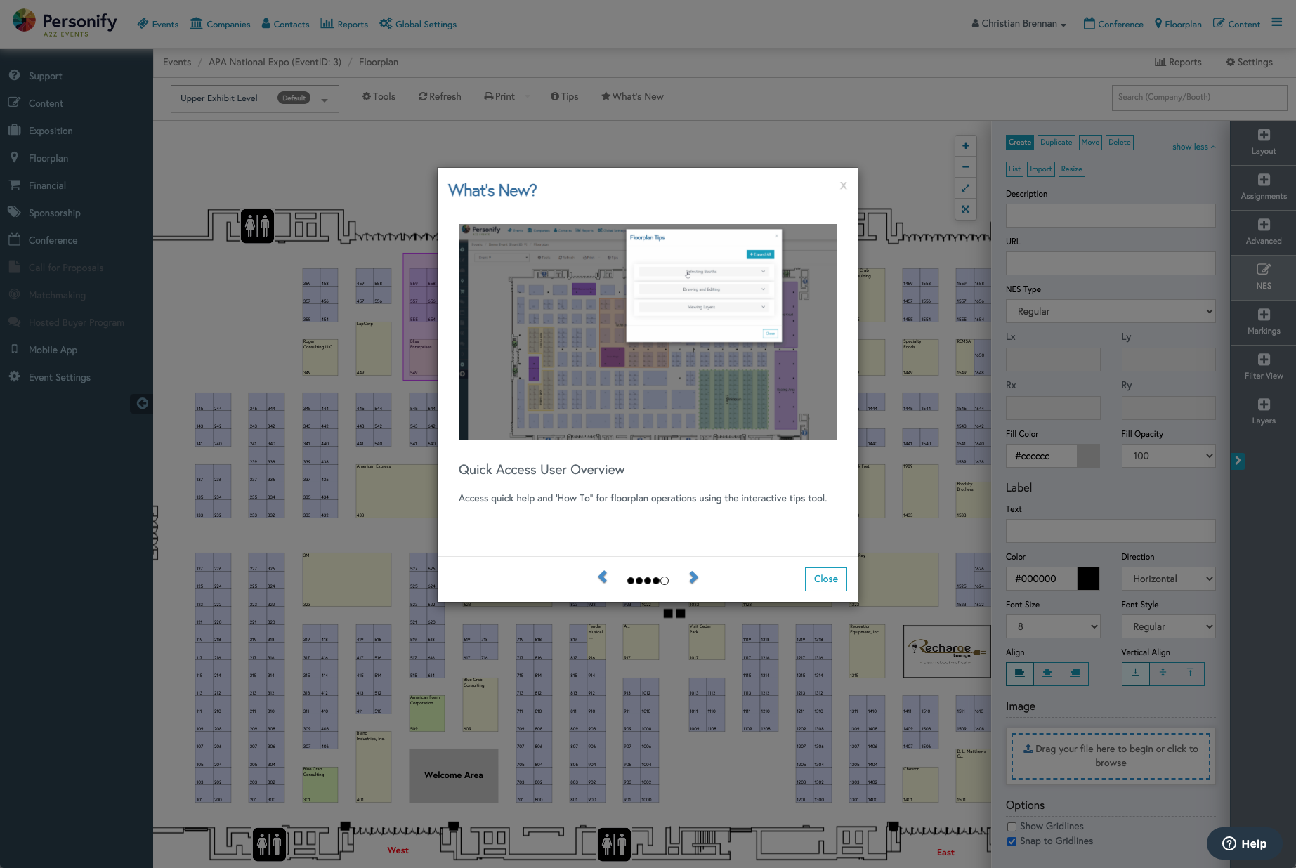
Ultimately, after various rounds of sketching, adjustments and internal A/B testing with the product team and leadership, we decided that a minified, far-right navigation would be the best fit for the re-design.
Prototyping
For me..the fun part.
Together with another very talented product designer, we began designing in Sketch and prototyping some initial low-fi and eventual high-fi options for consideration.
The 2 options for consideration were:
- A much more of a modern, unique and out-of-the-box option that would rely heavily on a simplified layout with a hamburger menu triggering different modals.
- Winner The minified, right-navigation option that displayed the menu on page load.
Additional Highlights
Overview:
Everything from how the H1 query title, the larger landing page search input, the results queries, filter pills and content hierarchy was condidered. See below some of the thoughts that went into all of it.
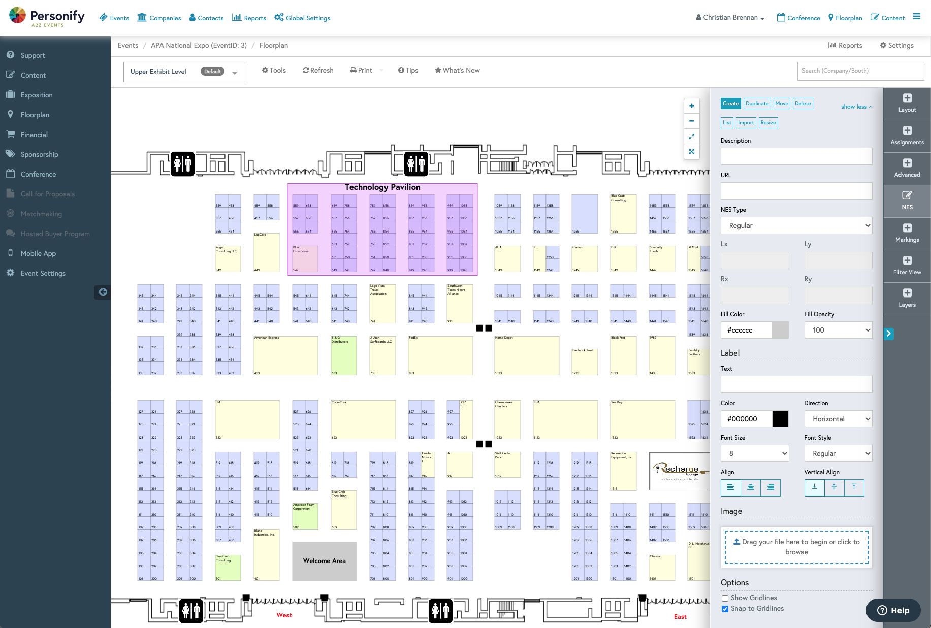
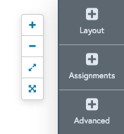
Through user research, one of the things we discovered was that our clients wanted more real estate when manipulating their floorplans. So we included the option for users to click the "Full-screen" toggle that would ignore everything in the browser and display the map in full-screen mode.
This new next generation floorplan for our users was quite the break from our classic environment so we decided to include modal triggers for "what's new, tips and tools." This provided clients a snap shot of all the new offerings.
Not only did the color scheme have to fit with our internal, established brand and design system, but it had to be universal enough to plug in to our base or highly-customized client event sites.
Shipped to Production